Input toolbar
The input area includes a toolbar for sending more than plain text. By default, ChatUI uses a flat items array with emoji, images, files, and a conditional photo button.
Reference artwork only. Channel filters, header extensions, and similar product features are implemented by your app.
Practical limits
Use these as practical size references; actual limits still depend on the SDK build and browser:
- Single image or file: on the order of 100 MB, bounded by the browser and OS file picker.
- Very large GIFs may be sent as a normal file or image message.
- Short video duration and resolution depend on the SDK build and browser.
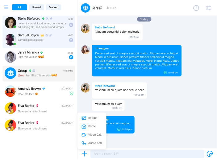
Built-in item IDs
Built-in IDs are defined by InputMenumID:
| ID | Description |
|---|---|
InputMenumID.EMOJI | Opens the emoji panel. |
InputMenumID.PLUS | Optional "plus" item you can use in your own custom menu tree. The default menu does not add it automatically. |
InputMenumID.IMAGES | Pick images from the gallery. |
InputMenumID.FILES | Pick local files. |
InputMenumID.PHOTO | Open the camera for a still photo. The built-in filter shows it only on https:, file:, or localhost, and not on mobile browsers. |
The default order is:
EMOJIIMAGESFILESPHOTOwhen its built-in filter passes
If your product wants a secondary menu, add your own InputMenumID.PLUS item and place nested submenu entries under it.
Reference artwork. Inspect cloneInputMenu() output for the authoritative tree.
Configuration shape
The toolbar is described by InputMenu, which has a single items array of InputMenumItem.
Each InputMenumItem field:
| Property | Description |
|---|---|
id | Item id; used in click events and i18n keys. |
order | Sort order among siblings; lower values come first. |
icon / hoverIcon | Icon URLs. |
submenu | Optional nested items; when present, tapping opens the submenu instead of firing a send action immediately. |
filter | Optional (channelModel: ChatUIChannelModel) => boolean to hide items per channel. |
Read and write
Use cloneInputMenu, mutate the result, then call setInputMenu before app.ready().
import { InputMenumID, type InputMenu } from '@nexconn/chatui';

const menu: InputMenu = app.cloneInputMenu();
menu.items.push({
  id: InputMenumID.PLUS,
  order: 10,
  icon: 'https://example.com/plus.svg',
  submenu: [
    {
      id: 'input.menu.item.location',
      order: 0,
      icon: 'https://example.com/location.svg',
    },
  ],
});
app.setInputMenu(menu);
Custom items and clicks
Pick string ids that do not collide with InputMenumID. If an item needs visible labels (for example inside your own secondary menu), add keys on the Localization page.
Custom item taps emit ChatUIEvents INPUT_MENU_ITEM_CLICK with InputMenuItemClick (id and current ChatUIChannelModel).
import { ChatUIEvents } from '@nexconn/chatui';

app.addEventListener(ChatUIEvents.INPUT_MENU_ITEM_CLICK, (evt) => {
  const { id, channelModel } = evt.data;
  if (id === 'input.menu.my.item') {
    // Your logic
  }
});
Built-in send actions are handled by the SDK and usually do not emit INPUT_MENU_ITEM_CLICK; use the event for your own extensions.