Components overview
ChatUI SDK exposes Web Components (custom elements). You can mount tags from any framework or create them with the DOM APIs.
Providers and presentation
- Providers: Containers tied to ChatUI state and lifecycle. Customize behavior through
NCChatUIApplicationAPIs instead of relying on provider internals. - Presentation nodes: Rendered together with providers as custom elements.
All SDK elements use the nc- prefix (for example the root nc-chat-ui-app-provider). In Vue, register nc-* as native custom elements so Vue does not parse them as Vue components (see Quickstart isCustomElement).
The package does not export a public tag-name enum. The tags in Main layout are the recommended tags to mount directly. Other registered tags are implementation details unless a specific documentation page tells you to mount them.
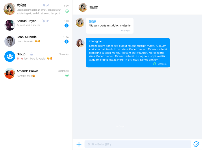
Main layout
After a successful connection and app.ready(), mount nc-chat-ui-app-provider for the full chat shell (data and events flow from NCChatUIApplication). Typical children:
nc-channel-list-container-provider: Channel list region.nc-channel-list-provider: The list inside the channel container.nc-channel-detail-provider: Channel detail region.nc-channel-detail-bar-provider: Header area in the detail region.nc-message-list-provider: Message list.nc-input-provider: Input area.
You may omit the root provider and embed the two child providers only, handling outer layout and routing yourself.
For layout-level switches such as channel bar visibility or title, see Layout controls. For row styling, see Channel list items.
Internal built-in providers
ChatUI registers a larger provider set when ready() runs. Common inner providers include:
nc-emoji-panel-providernc-modal-providernc-toast-providernc-file-transfer-ctrl-providernc-mention-users-panel-providernc-multi-choice-menu-provider
Treat these tags as internal building blocks unless you need to inspect a specific built-in region.
Internal message and utility elements
The SDK also registers message and utility custom elements, including:
nc-text-messagenc-image-messagenc-gif-messagenc-file-messagenc-short-video-messagenc-hd-voice-messagenc-reference-messagenc-combine-messagenc-message-bubblenc-message-sent-statusnc-connection-statusnc-read-receipt-modal
These elements are mounted by ChatUI's providers; your app usually does not instantiate them directly.
Custom message tags
When you call registerCustomMessages, ChatUI prefixes the DOM tag it registers with nc-c-.
If your registration uses:
component: {
  tagName: 'gift-message',
  elementClass: GiftMessageElement,
}
the runtime custom element tag becomes nc-c-gift-message.
Mount example
const root = document.createElement('nc-chat-ui-app-provider');
root.style.width = '100%';
root.style.height = '100%';
document.body.appendChild(root);
For initialization steps, see Quickstart.