Theme customization
Chat UI supports theme customization. The current iOS SDK exposes one built-in theme (Lively) and allows creating custom themes based on it.
Overview
Chat UI's theme system provides flexible customization capabilities:
- Built-in themes: Currently only exposes the Lively theme
- Custom themes: Supports color and image customization based on built-in themes
- Dark mode: Automatically adapts to system dark mode on iOS 13+
- Runtime switching: Seamless theme switching without app restart
Preview
| Lively theme - light | Lively theme - dark |
|---|---|
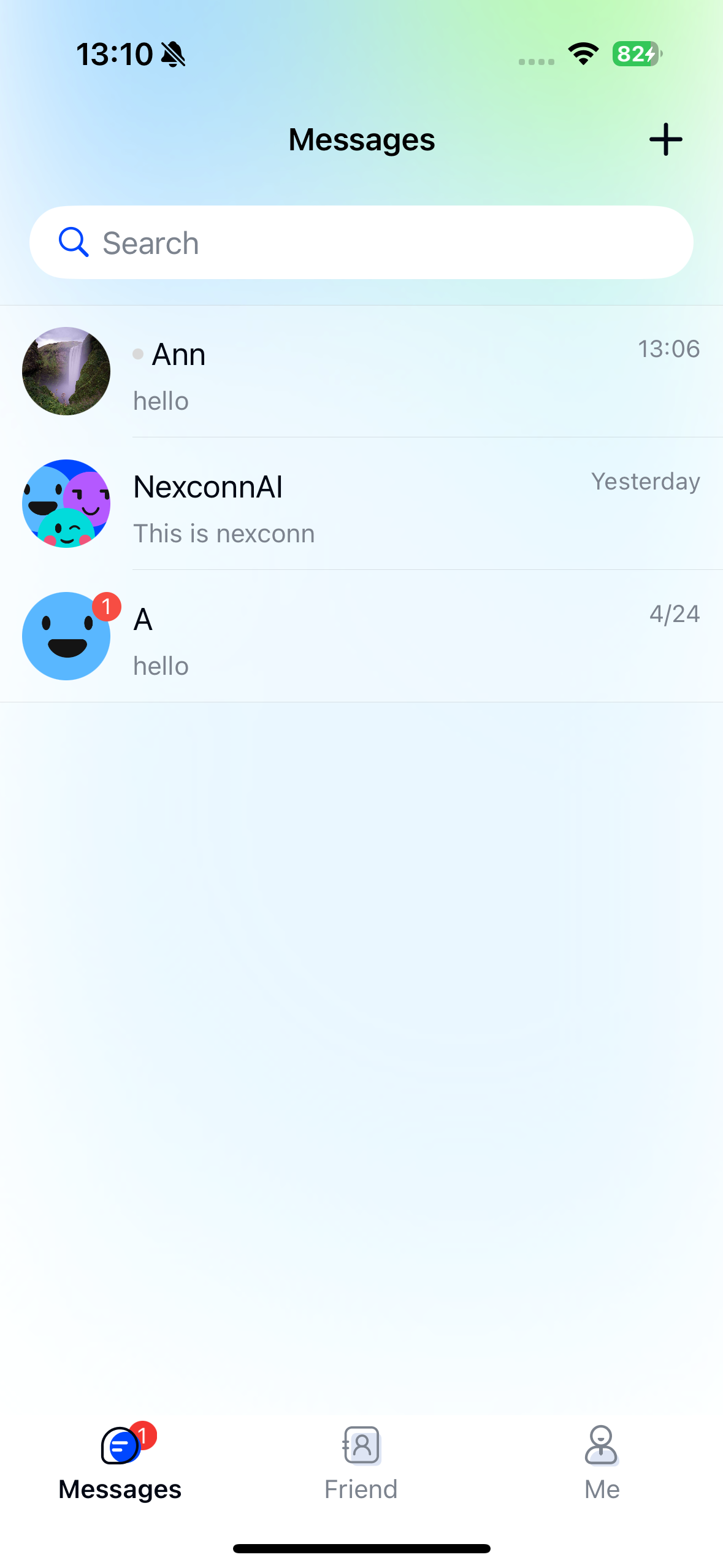 | 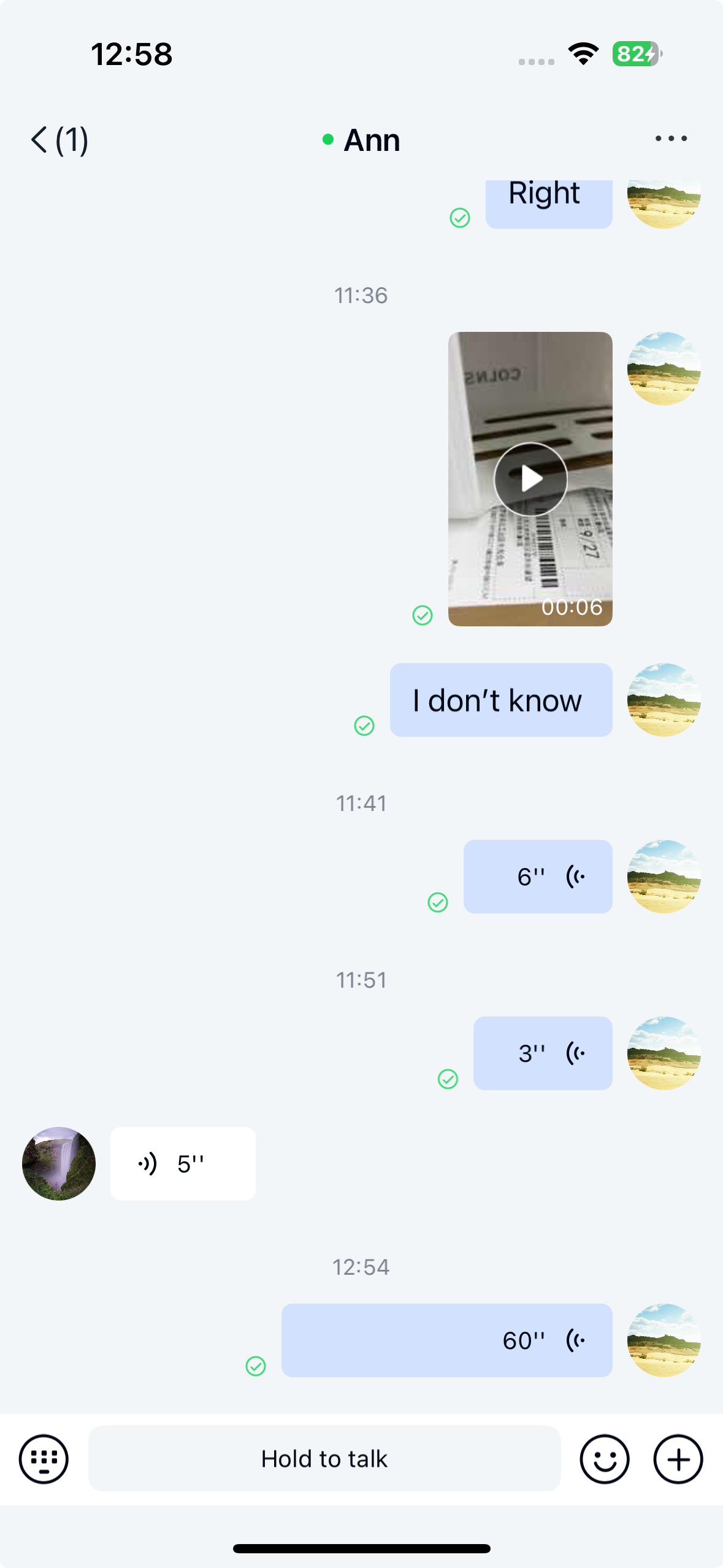 |
Theme resources
The NexconnChatUI.framework contains resource bundles like NCChatUILively.bundle and NCChatUI.bundle. The public NCChatUIBuiltInThemeType enum currently only includes NCChatUIBuiltInThemeTypeLively - do not use legacy Tradition enum values in your code.
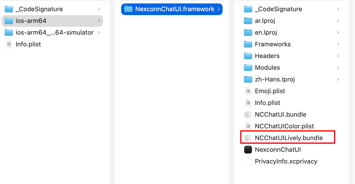
Right-click NCChatUILively.bundle and select Show Package Contents to view theme resources. For example, the Lively theme contains:
theme.plistfile with color and image configurationsresourcesfolder with image assets

To create a new theme, provide a bundle with:
theme.plistfile (add required keys - missing keys will fall back to built-in theme)resourcesfolder with images
Quick start
Using built-in themes
Apply the Lively theme:
#import <NexconnChatUI/NexconnChatUI.h>

// Switch to Lively theme
[NCChatUIThemeManager changeInnerTheme:NCChatUIBuiltInThemeTypeLively];
Architecture
Core classes
NCChatUIThemeManager
Manages theme switching and resource access.
Key methods:
| Method | Description |
|---|---|
changeInnerTheme: | Switch built-in theme |
changeCustomTheme:baseOnTheme: | Apply custom theme |
currentInnerThemesType | Get current built-in theme type |
dynamicColor:lightColor:darkColor: | Get dynamic color |
dynamicImage:defaultImageName: | Get dynamic image |
addThemeDelegate: | Add theme change listener |
removeThemeDelegate: | Remove theme change listener |
NCChatUITheme
Custom theme class for loading and managing theme resources.
Properties:
| Property | Type | Description |
|---|---|---|
name | NSString | Theme name |
colors | NSDictionary | Color configurations |
images | NSDictionary | Image configurations |
resourcePath | NSString | Resources folder path |
plistPath | NSString | Config file path |
NCChatUIBuiltInThemeType
Built-in theme enum.
typedef NS_ENUM(NSInteger, NCChatUIBuiltInThemeType) {
    NCChatUIBuiltInThemeTypeLively // Lively theme
};
Theme switching
Using built-in themes
Apply Lively theme
[NCChatUIThemeManager changeInnerTheme:NCChatUIBuiltInThemeTypeLively];
Get current theme
NCChatUIBuiltInThemeType currentType = [NCChatUIThemeManager currentInnerThemesType];
if (currentType == NCChatUIBuiltInThemeTypeLively) {
    NSLog(@"Using Lively theme");
}
Theme change listeners
Implement NCChatUIThemeDelegate to listen for theme changes:
#import <NexconnChatUI/NexconnChatUI.h>

@interface YourViewController () <NCChatUIThemeDelegate>
@end

@implementation YourViewController

- (void)viewDidLoad {
    [super viewDidLoad];
    [NCChatUIThemeManager addThemeDelegate:self];
}

- (void)dealloc {
    [NCChatUIThemeManager removeThemeDelegate:self];
}

#pragma mark - NCChatUIThemeDelegate

- (void)themeDidChanged:(NCChatUITheme *)customTheme
        baseOnTheme:(NCChatUIBuiltInThemeType)type {
    NSLog(@"Theme changed: %@", type == NCChatUIBuiltInThemeTypeLively ? @"Lively" : @"Unknown");
    [self updateUIForNewTheme];
}

- (void)updateUIForNewTheme {
    [self.tableView reloadData];
    [self updateNavigationBar];
    // Update other UI components
}

@end
Dark mode support
Chat UI automatically adapts to system dark mode on iOS 13+.
- iOS 13+: Full dark mode support
- Below iOS 13: Light mode only
Custom themes
Creating custom themes
Step 1: Prepare theme resources
Folder structure:
MyCustomTheme/
├── theme.plist          # Theme config
└── resources/           # Image assets
    ├── icon_add@2x.png
    ├── icon_add@3x.png
    └── ...
Step 2: Configure theme.plist
Example theme.plist:
<?xml version="1.0" encoding="UTF-8"?>
<!DOCTYPE plist PUBLIC "-//Apple//DTD PLIST 1.0//EN" "http://www.apple.com/DTDs/PropertyList-1.0.dtd">
<plist version="1.0">
<dict>
    <key>name</key>
    <string>MyCustomTheme</string>

    <key>colors</key>
    <dict>
        <key>primary_color</key>
        <string>#FF6B00</string>
        <key>title_of_first_level_color</key>
        <string>#1A1A1A</string>
        <key>title_of_secondary_level_color</key>
        <string>#666666</string>
        <key>common_background_color</key>
        <string>#FFFFFF</string>
    </dict>

    <key>images</key>
    <dict>
        <key>conversation_input_bar_add_img</key>
        <string>icon_add.png</string>
        <key>conversation_input_bar_emoji_img</key>
        <string>icon_emoji.png</string>
    </dict>
</dict>
</plist>
Step 3: Add to Xcode project
- Drag folder into project
- Select "Create folder references"
- Ensure files are added to target
Step 4: Apply custom theme
NSString *themePath = [[NSBundle mainBundle] pathForResource:@"MyCustomTheme" ofType:nil];
NCChatUITheme *customTheme = [[NCChatUITheme alloc] initWithThemePath:themePath];
[NCChatUIThemeManager changeCustomTheme:customTheme
                        baseOnTheme:NCChatUIBuiltInThemeTypeLively];
Custom theme priority
Resource loading order:
- Custom theme configurations
- Built-in theme resources
- Transparent color fallback
NCChatUILively.bundle structure
NCChatUILively.bundle/
├── light/
│   ├── theme.plist     # Light theme config
│   └── resources/      # Light images
└── dark/
    ├── theme.plist     # Dark theme config
    └── resources/      # Dark images
theme.plist structure
<dict>
    <key>name</key>
    <string>light</string>

    <key>colors</key>
    <dict>
        <key>primary_color</key>
        <string>#0047FF</string>
    </dict>

    <key>images</key>
    <dict>
        <key>conversation_input_bar_add_img</key>
        <string>inputbar_add.png</string>
    </dict>
</dict>
Creating custom bundles
Follow the same structure as NCChatUILively.bundle:
- Create bundle folder
- Add
theme.plist - Add
resources/with images - Add to project
Color configuration
Common color keys
| Key | Usage |
|---|---|
primary_color | Buttons, links |
text_primary_color | Main text |
common_background_color | Background |
line_background_color | Dividers |
Color formats
Supported formats:
#RRGGBB(e.g.#0047FF)#RRGGBBAA(e.g.#0047FF80for 50% opacity)
Key pages
Channel list
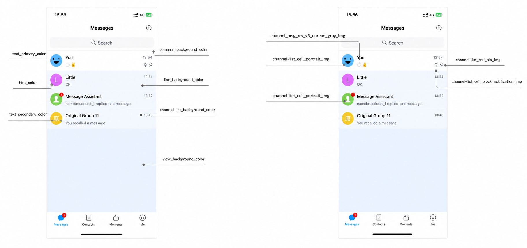
Customizable elements
Colors:
- Background:
common_background_color - Channel name:
text_primary_color - Last message:
text_secondary_color
Images:
- Avatar:
conversation-list_cell_portrait_img - Pin icon:
conversation-list_cell_pin_img
Channel view
Input bar
Colors:
- Background:
auxiliary_background_1_color - Text:
text_primary_color
Images:
- Add button:
conversation_input_bar_add_img - Emoji button:
conversation_input_bar_emoji_img
Best practices
Theme switching timing
// App launch
- (BOOL)application:(UIApplication *)application
    didFinishLaunchingWithOptions:(NSDictionary *)launchOptions {
    NSInteger themeType = [[NSUserDefaults standardUserDefaults] integerForKey:@"ThemeType"];
    [NCChatUIThemeManager changeInnerTheme:themeType];
    return YES;
}

// User settings
- (void)userDidSelectTheme:(NCChatUIBuiltInThemeType)themeType {
    [NCChatUIThemeManager changeInnerTheme:themeType];
    [[NSUserDefaults standardUserDefaults] setInteger:themeType forKey:@"ThemeType"];
}
Custom UI adaptation
@interface CustomViewController () <NCChatUIThemeDelegate>
@property (nonatomic, strong) UIView *customView;
@end

@implementation CustomViewController

- (void)viewDidLoad {
    [super viewDidLoad];
    [NCChatUIThemeManager addThemeDelegate:self];
    [self setupCustomUI];
}

- (void)setupCustomUI {
    UIColor *bgColor = [NCChatUIThemeManager dynamicColor:@"common_background_color"
                                              lightColor:@"#FFFFFF"
                                               darkColor:@"#000000"];
    self.customView.backgroundColor = bgColor;
}

- (void)themeDidChanged:(NCChatUITheme *)customTheme
        baseOnTheme:(NCChatUIBuiltInThemeType)type {
    [self setupCustomUI];
}

@end